

CI · Brand
What the name and the logo mean
The name GRIDAEND holds two things: where the business is headed, and how we work alongside you.
Naming
Three words, one name
Grid
the network
The direction of the business: to tie scattered sites and equipment — and manufacturing, construction, and finance — into a single network.
And
alongside
A promise to go alongside you. That is why the lime accent in the wordmark sits on this ‘And’.
End
to the end
To stay from the start of a project through to operations. The finish line is twenty years of operation, not commissioning.
“Tie energy into one grid (Grid), go alongside you (And), and stay to the end of the project (End).”
The brand is always written as one word: GRIDAEND. We split it into three on this page only.
Logo
Symbol and wordmark
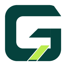
Symbol
A G inside a rounded square. The diagonal cut through it is energy moving across the grid; the diagonal lime bar below stands for the connection to you, and for growth.

Wordmark
GRIDAEND set in a geometric sans serif. The lime accent on the ‘A’ runs through the middle of the name, joining Grid to End.
Symbol for dark backgrounds (white)

Wordmark for dark backgrounds (white)
Color
Brand colors
Deep Teal Green
Primary · header, dark bands, emphasis in body text
Lime
Accent · primary buttons, key figures
Deep Ground
Footer · deepest background
Tint
Section backgrounds · table headers
Free assessment
It starts with one line: the site address.
Leave the address and a way to reach you. We send back an initial assessment report within about five business days.
If the site stands up as a project, the report also sets out competitive EPC bids and financing terms.
Available to landowners, building owners, or their authorized representatives · Results come back as a report